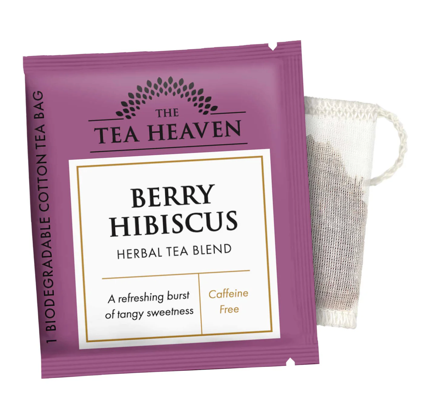
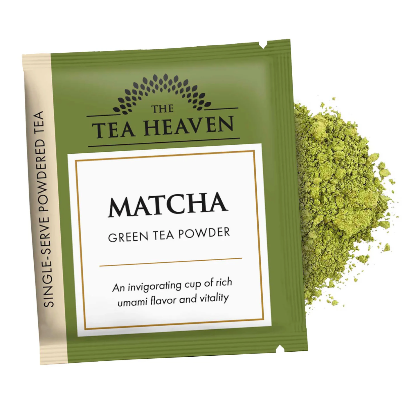
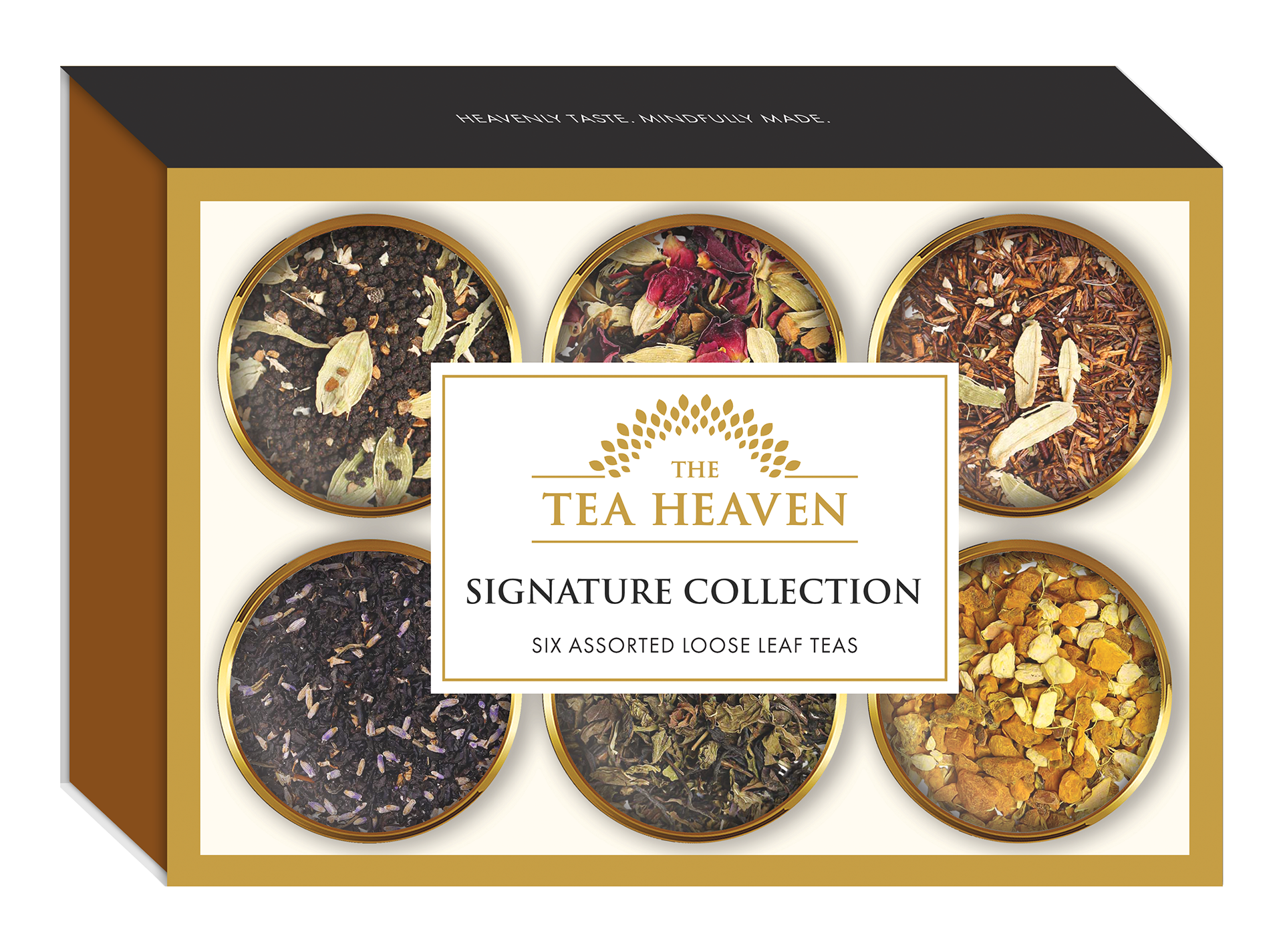
The Tea Heaven's previous packaging lacked consistency and was visually cluttered. In the process of redesigning that packaging and creating packaging designs for new products, I selected a color palette that incorporated vibrant jewel tones and rich, earthy tones that aligned with the brand's positioning as high-end and eco-friendly.
I pulled a more simple and elegant pattern from some of the company's old gift box packaging and brought that into the canister label designs. Then across all of the labels and packaging, I brought in contrast and consistency with black and white text and label sections, while using the honey and bronze brand colors to help create hierarchy and division. I also designed the secondary version of the brand logo mark, which allowed for much more space on the front of the label, as well as the new icons for company values and steeping instructions.
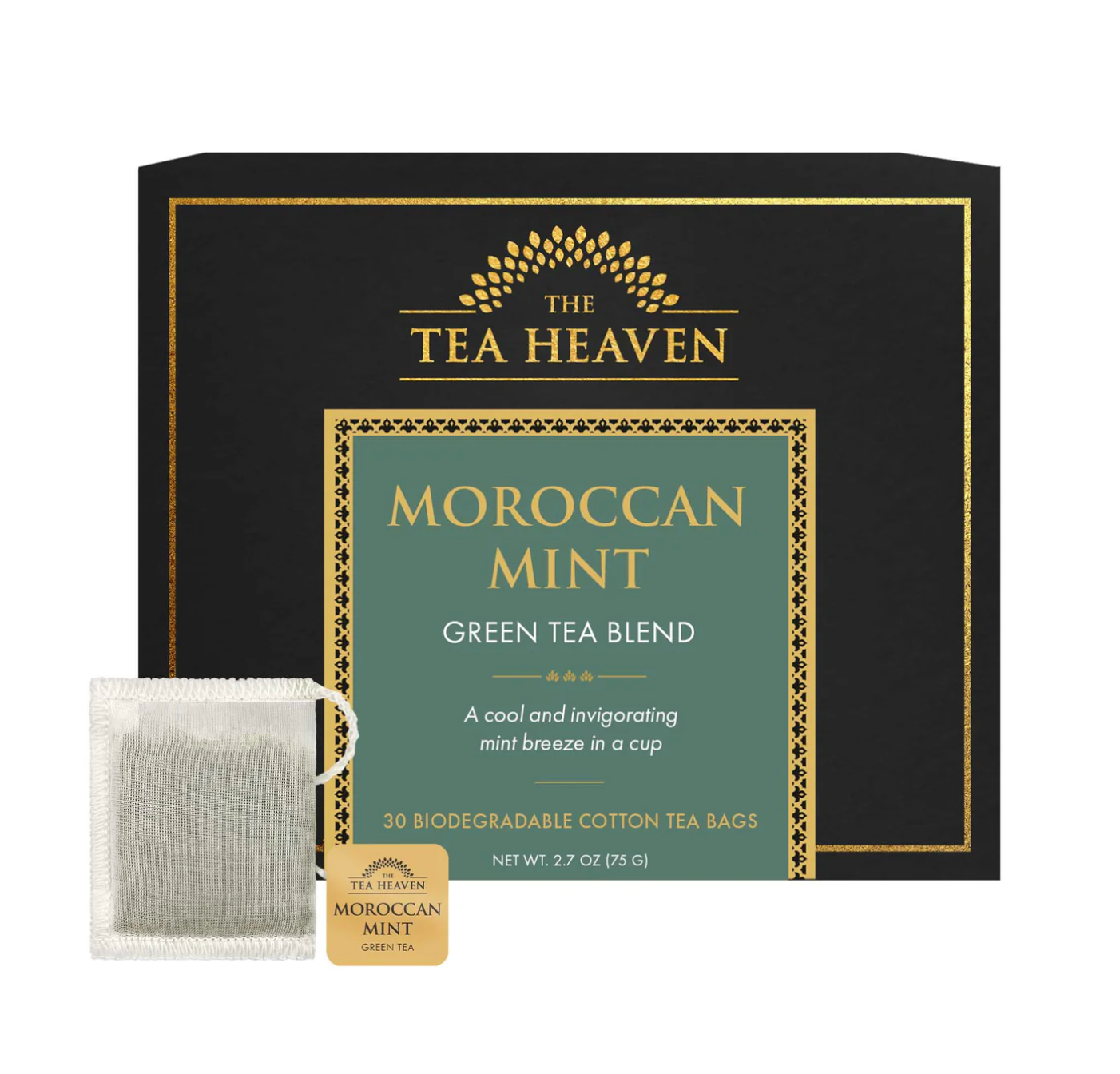
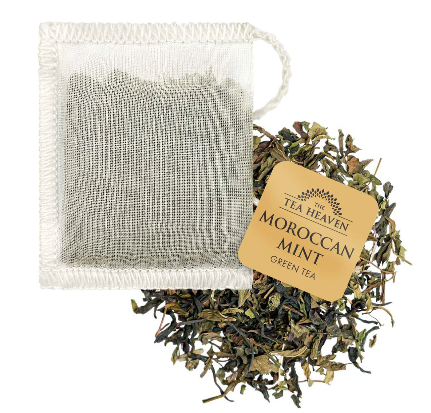
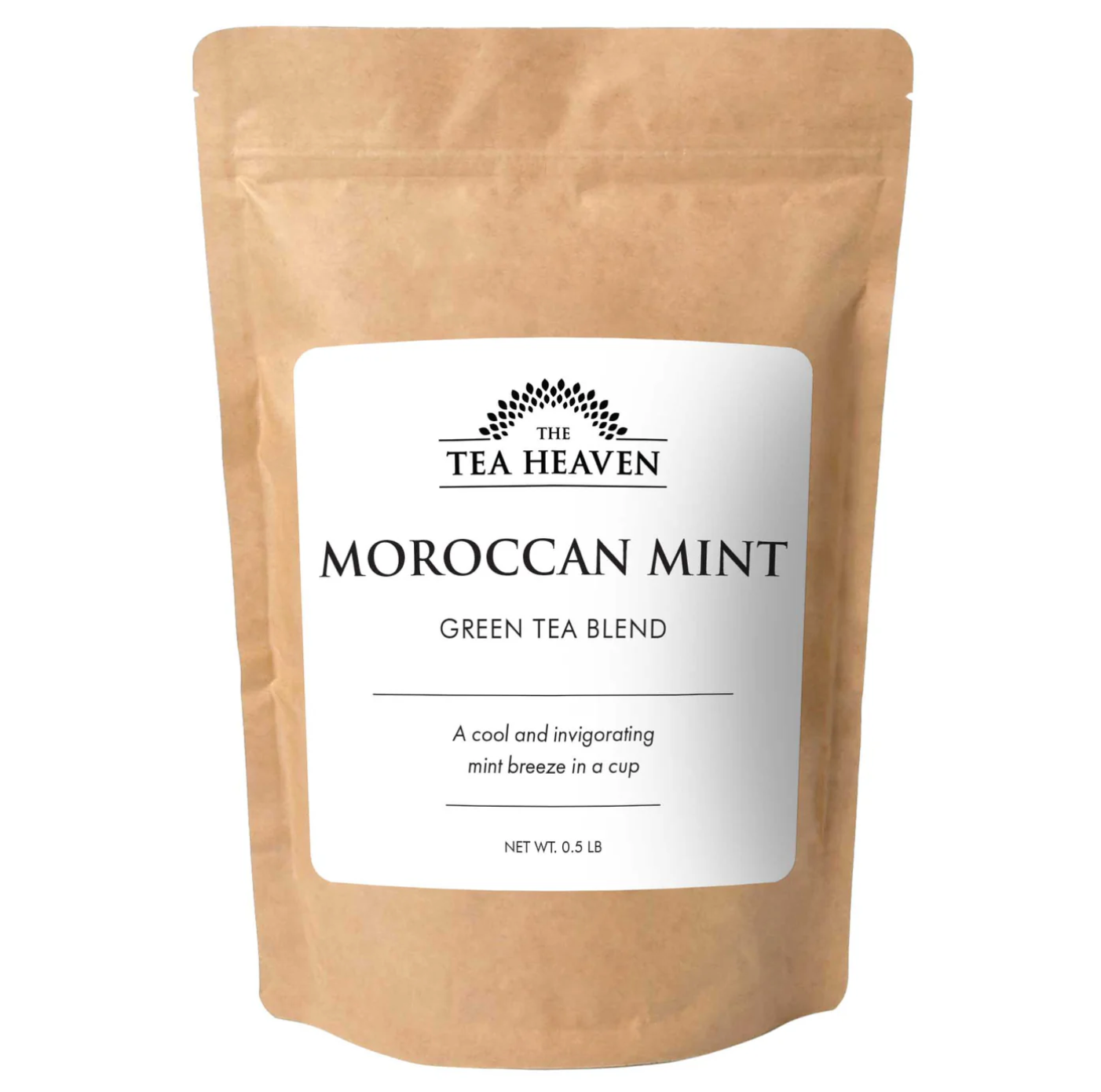
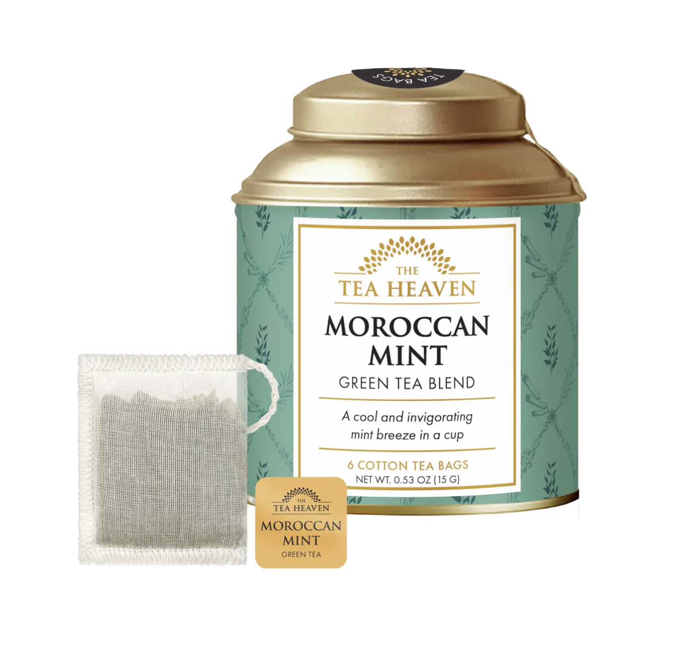
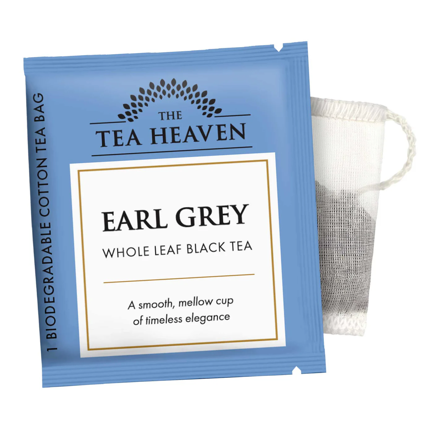
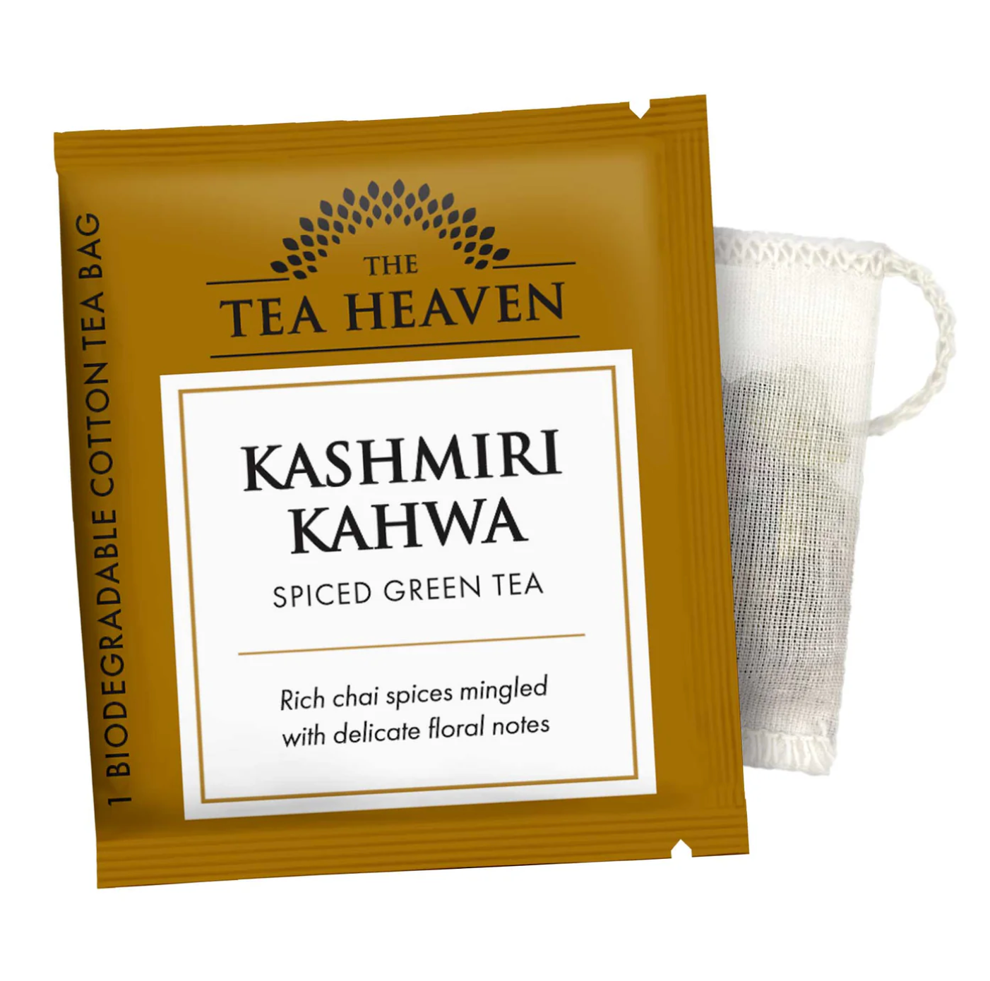
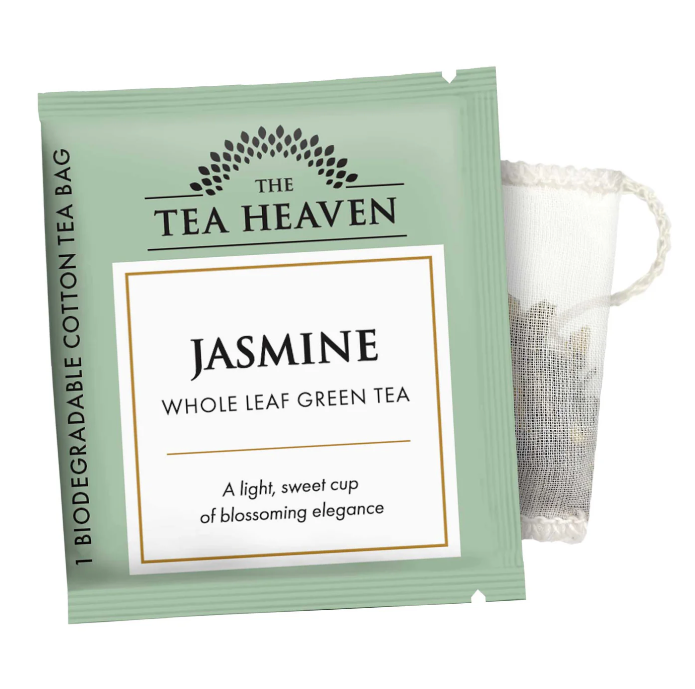
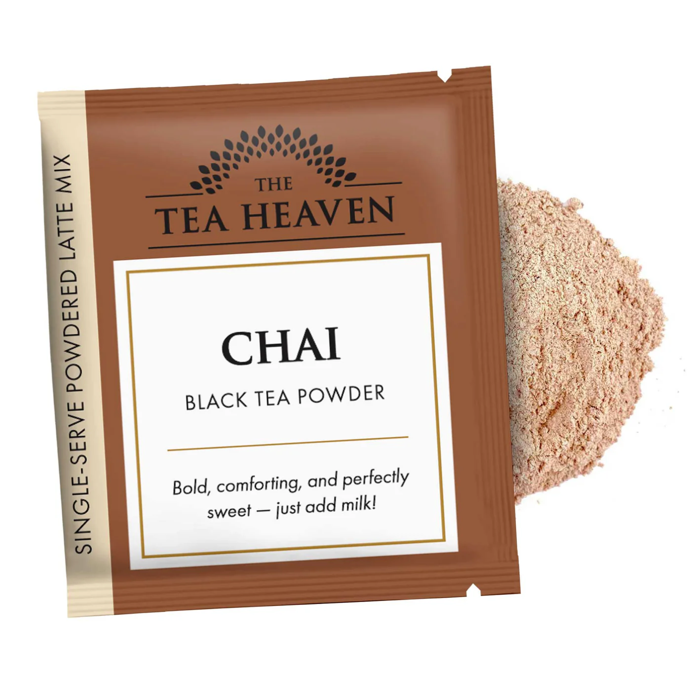



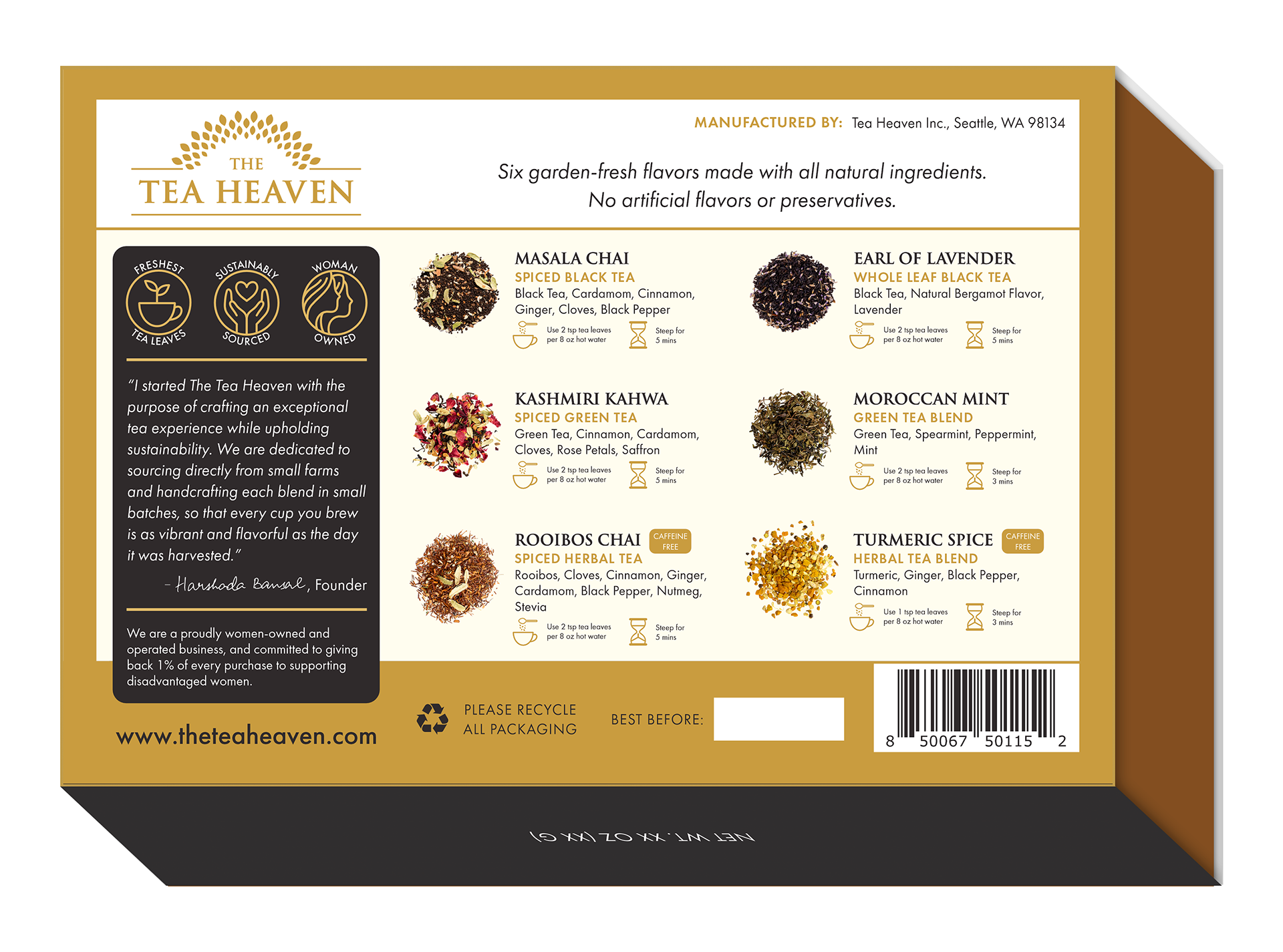

The Tea Heaven product packaging redesign was a solo project, designed and executed by myself under the supervision of CEO Harshada Bansal. These designs were created in Adobe Illustrator.
