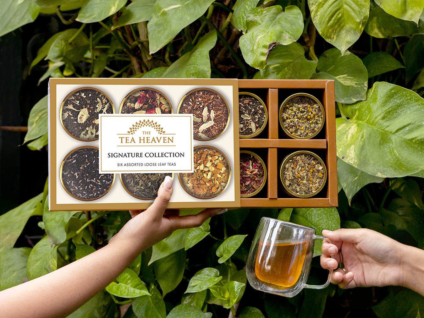
I joined The Tea Heaven as they began their transition from selling primarily in India to focusing on the US market. Not wanting to lose the recognizability of the previous logo in certain channels, we opted for a refresh and expansion of the branding rather than a complete overhaul.
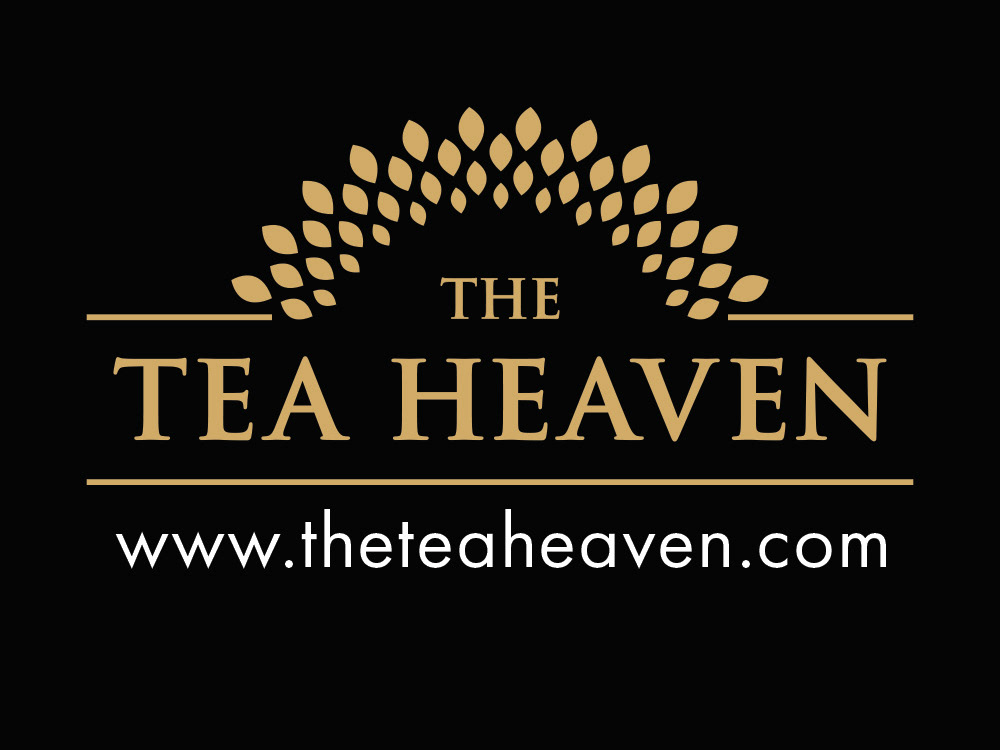
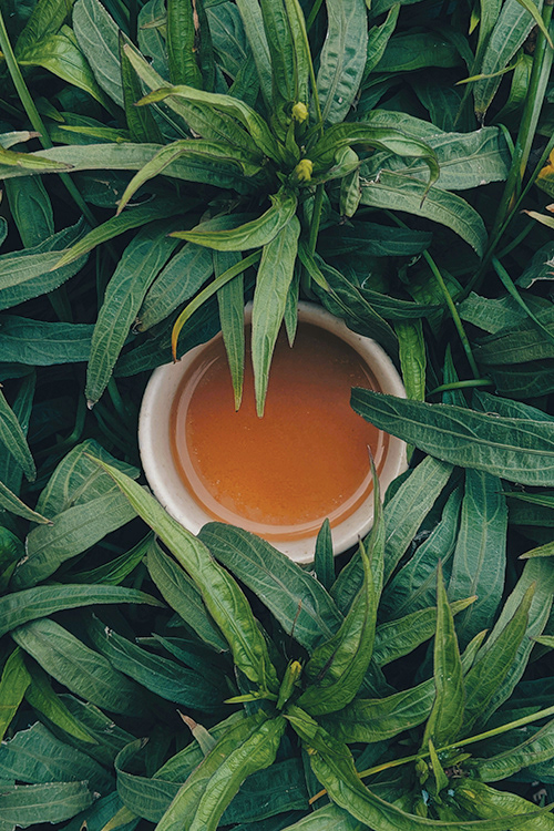
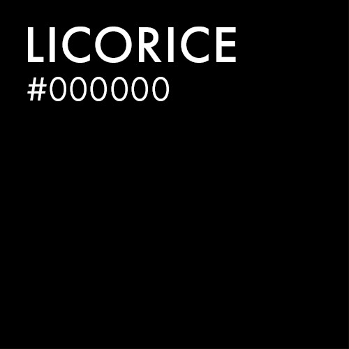
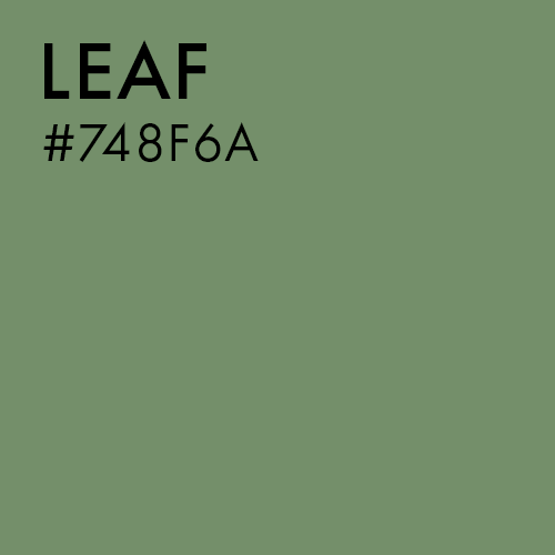
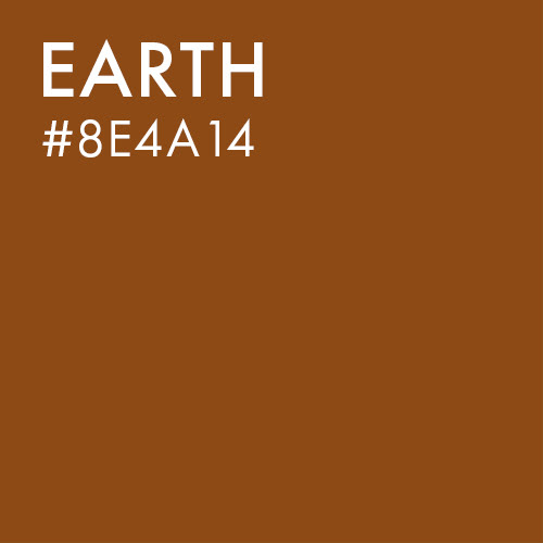
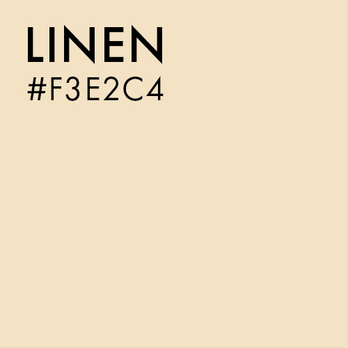
The original logo suffered from some common issues: low color contrast and scalability, poor kerning, and a barely-legible script as a secondary font. My work included an updated logo and new set of logo variations, as well as a new color palette, typography, icons, and illustrations. I also workshopped a new tagline and other brand copywriting, and carried these updates out across a wide range of print and digital assets.



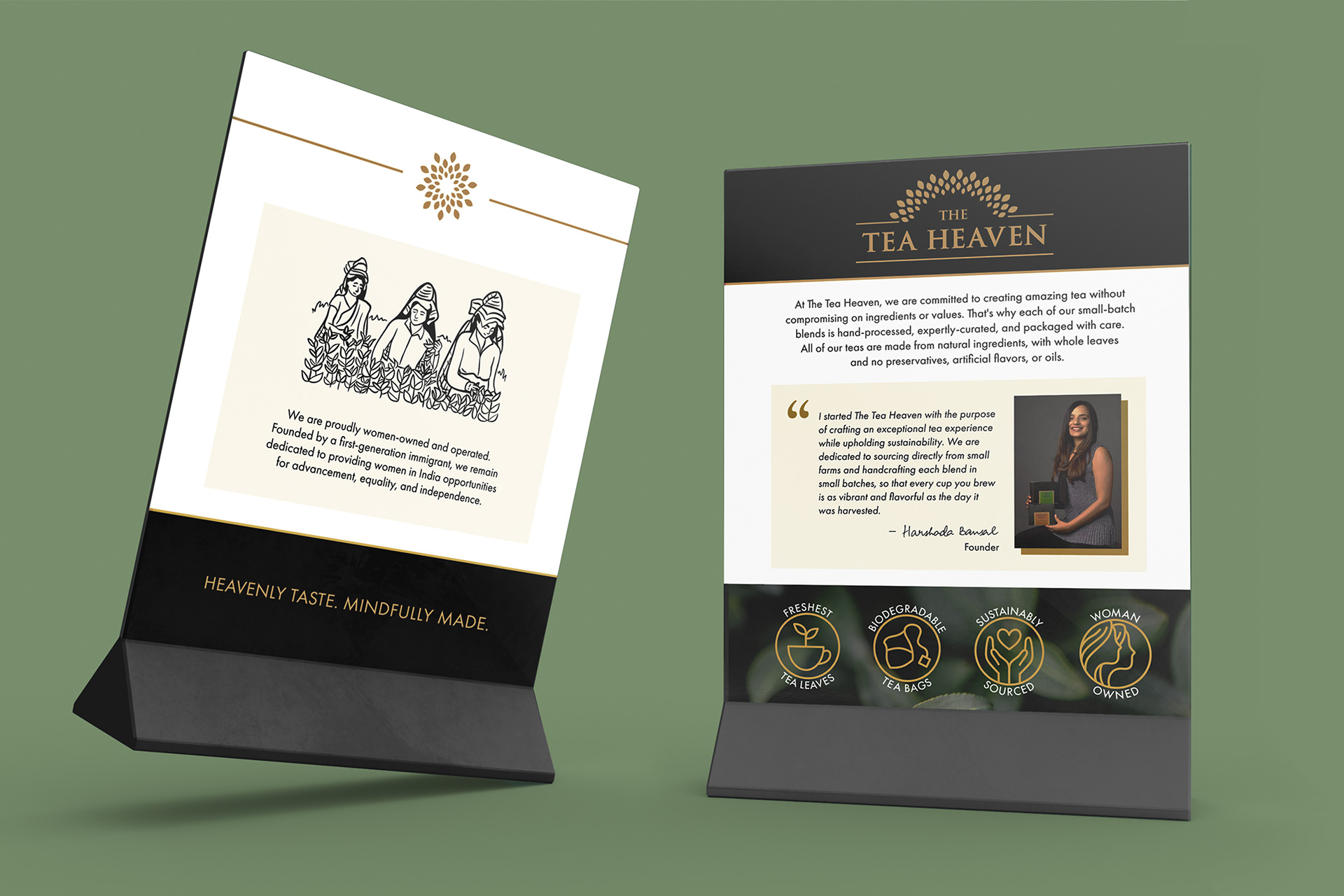
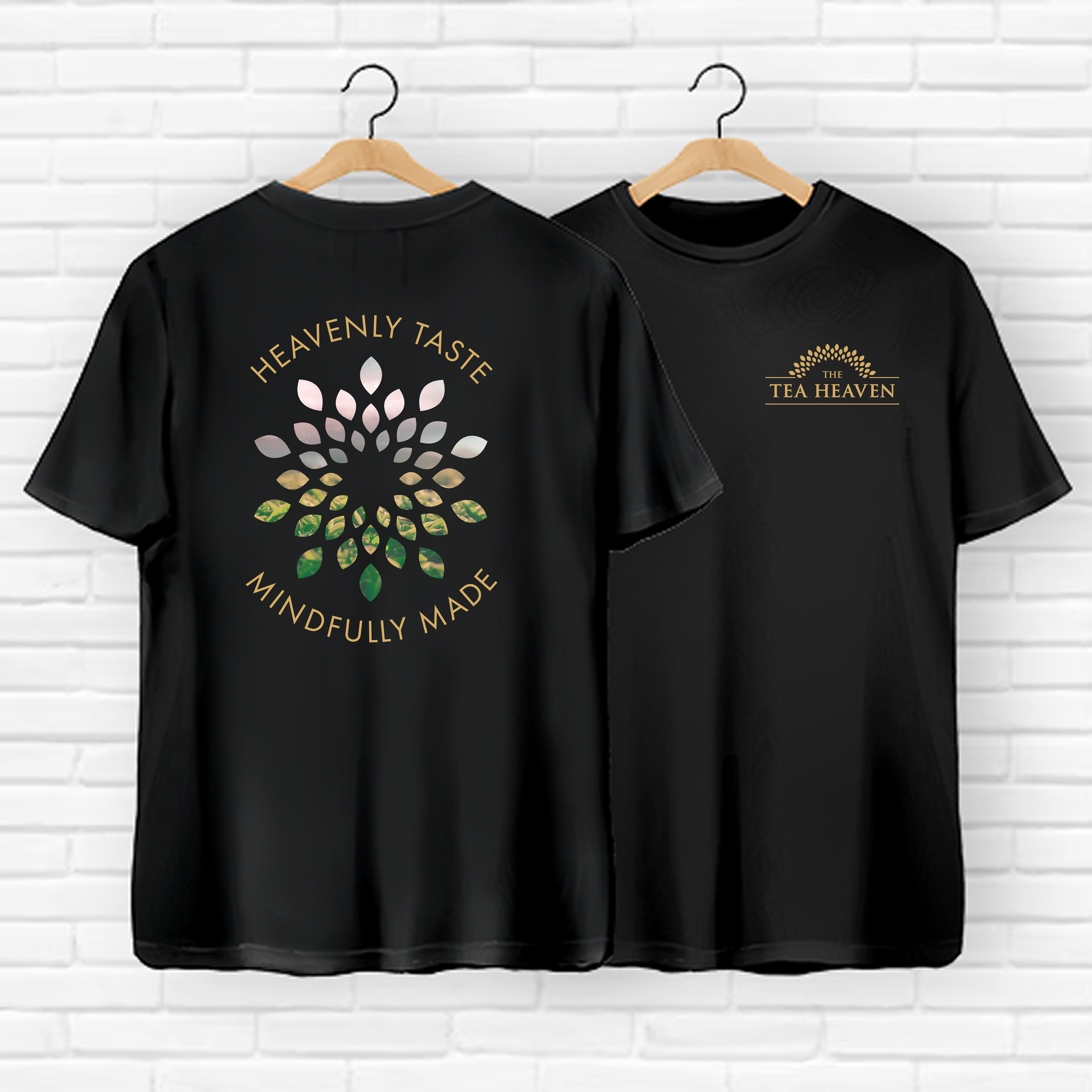
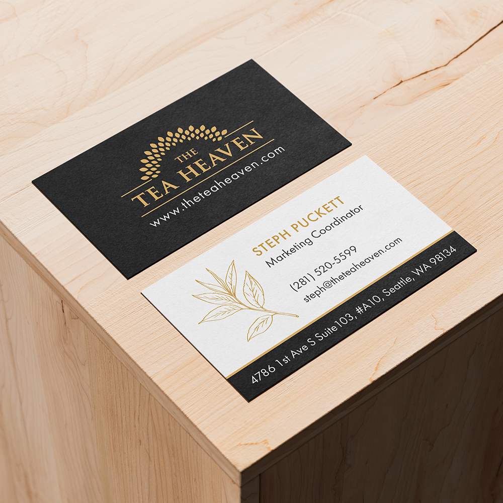
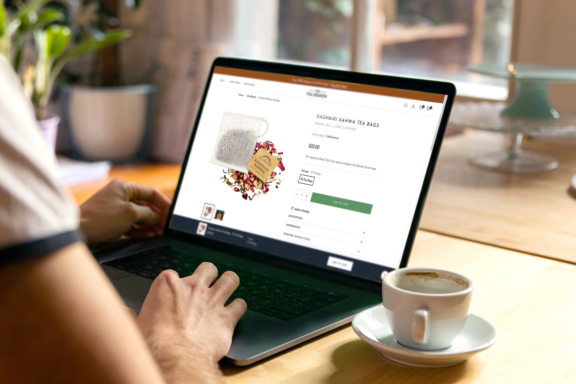
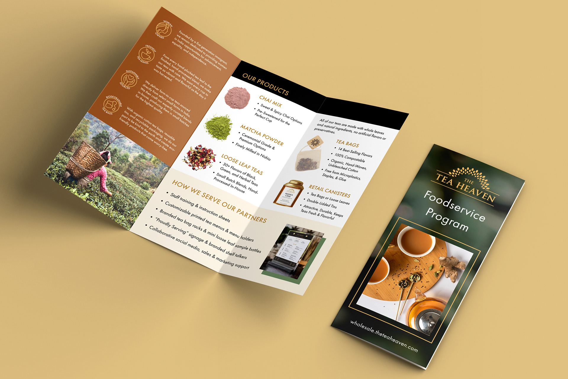
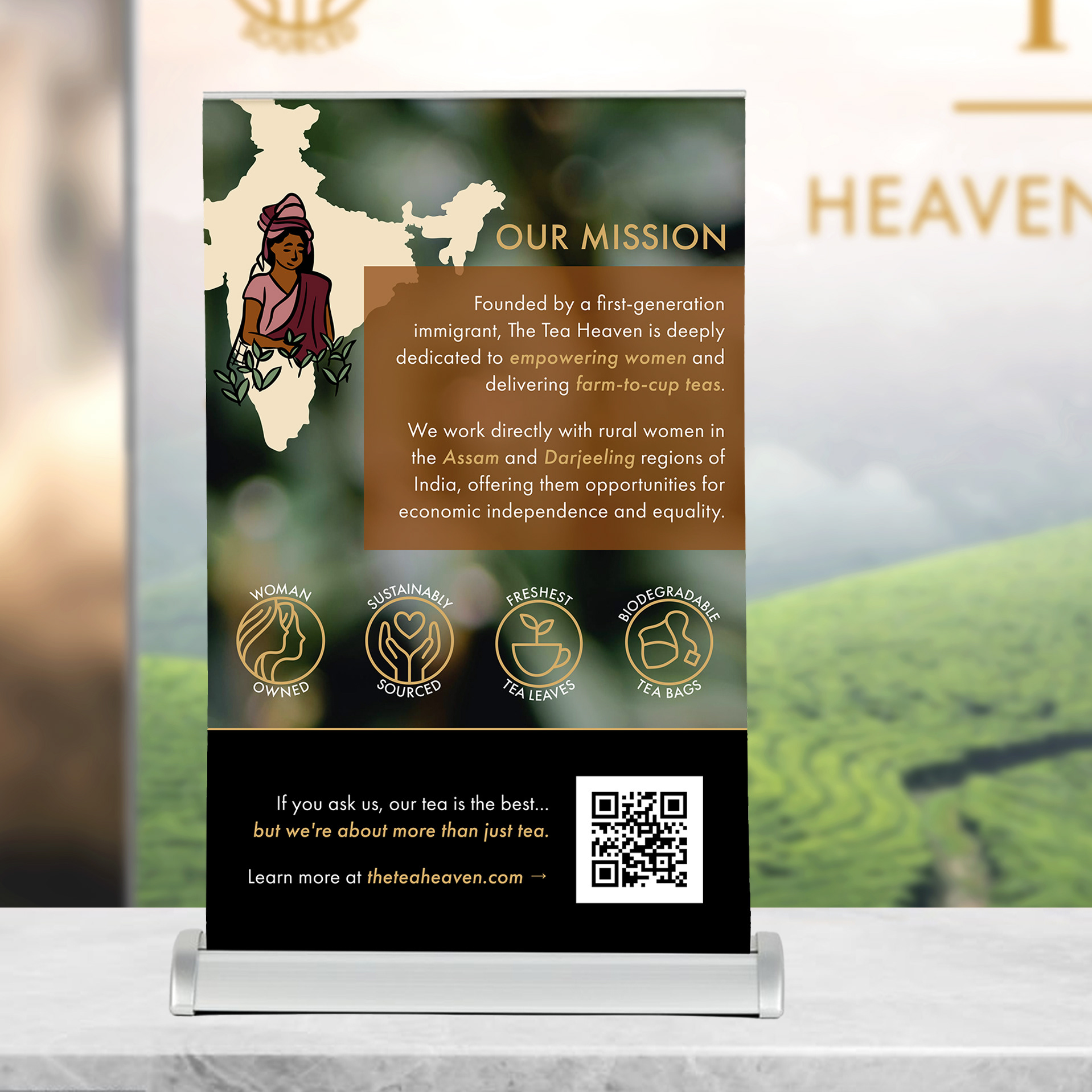
The Tea Heaven brand refresh was a solo project, designed and executed by myself under the supervision of CEO Harshada Bansal. All designs were created using Adobe Illustrator and InDesign.
